


The exhibition billed itself thus on its promotional materials. "The Infinite Mix: Contemporary Sound and Image brings together audiovisual artworks that are soulful and audacious in their exploration of a wide range of subjects. In all of the works in this exhibition the interplay between moving image and sound is crucial. Most of the artists have composed, commissioned or remixed soundtracks that relate to the visual element of their work in unexpected ways, and ensure that what you hear is just as important as what you see. The Infinite Mix includes works that address tumultuous histories and cultural tensions in ways that are thought-provoking as well as deeply entertaining. They also pointedly remix our notions of history and fiction, the real and the staged, and the sublime and the everyday. Drawing on varied genres including documentary filmmaking, music video, experimental film and theatrical performance, these artworks dispense with straightforward storytelling and unfold in a manner akin to musical compositions. Together, they expand the ways in which we experience moving images and sound, and open up new veins of meaning in art’s potentially ‘infinite mix.’"
The mix and important link of sound and visuals in all the pieces and variety of genres certainly whet my appetite and I was greatly looking forward to seeing what I may be able to glean from the exhibition. The examples of work on show were also interesting as they were all very contemporary from the last 3 years. It would be a great barometer of what is happening in the world of video installation in terms of content, exhibition and dissemination, aesthetic, audience interaction and technologically.
The first thing that really struck me was the exhibition space. A what seemed to be a store/office space had been converted into 10 bespoke studio space environments each well suited to the audio visual installations housed within. Video installations are often shoe-horned in or feel a little ill at ease to me in a gallery environment and the purpose built converted spaces of the installations I felt worked well. Equally the fact that they were all audio visual pieces enhanced the cohesiveness of the exhibition and the contemporary feel of it. This was backed up well by Alex Eagle, Creative Director of The Store and responsible for the exhibition "The future of all space is both the physical experience of being in that space and broadcasting that experience to the world."
The work was a mixed bag and due to time and queues unfortunately I did not have time to visit all 10 of the pieces on display.
What follows is the catalogue description of the each of the pieces of work that left an impression on me followed by my own thoughts on the pieces and how they inspired, influenced me or left me frustrated or exhilarated.
MARTIN CREED: WORK NO.1701 (2013)
Martin Creed’s work often focuses on a single movement or gesture. In Work No. 1701 a range of individuals cross a New York street, accompanied by a jubilant pop song written and performed by the artist. Talking about the film, Creed has commented that ‘doing things in life, living and working, is always using your body’, and that ‘life can look like a dance’. Work No. 1701 is a celebration of the act of getting from A to B, as well as the different ways in which people move through the world. Creed, who has been writing songs and leading a band for over 20 years, describes his music and his visual work as an ‘attempt to make something for the world’. As he explains, they both stem from the same place: the desire to ‘say hello, to try to communicate somehow.’

I loved the simplicity of this work and the variety of characters and emotions the simple idea was able to conjure up. From able bodied to disabled, young to old the piece created an interesting narrative. The effect was looped and as mentioned shot over a long period of time at the same location and the repetitiveness of the action drew attention to the characters as they were all performing the same basic task so the emphasis became HOW they completed the task. The music worked really well and in spite of the challenges many of the participants faced the piece remained upbeat and a celebration of them and their differences and all of us and our differences. It was screened on one screen and this did work but possibly could have been mixed up with split screens to add more interest as it was repetitive and visually not all that interesting after a while BUT as I mentioned earlier this felt like the point it took the location and other visual stimulus out of the equation so you did concentrate fully on the participants. Less possibly being more and the simplicity of visual and aural content to communicate ideas is what I took from the piece and is something I have always struggled to do.
STAN DOUGLAS: LUANDA-KISNSHASA (2013)
Shot like a documentary film on a set carefully crafted to resemble a legendary New York recording studio, Stan Douglas’s Luanda-Kinshasa depicts a fictional 1970s jazz-funk band engaged in a seemingly endless real-time jam. The band’s music echoes the then-current confluence of American jazz, funk and Afrobeat – a musical fusion made possible, as the video’s title indirectly implies, by the emerging independence and rising profile of African nations. As the camera appears to seamlessly circle around the studio, the sound mix highlights whichever musician it lingers on, enhancing the impression that we are watching a live performance. But the band’s improvisation is actually a construction: intricately remixed by Douglas in the editing room, it extends through over six hours of ‘alternate takes’ created by recombining various shots and accompanying sections of music. Conjuring a never-ending sequence of variations, Luanda-Kinshasa conjures a vision of culture as a potentially ‘infinite mix.’

This was an interesting piece and I really loved the ideas behind it. To me though the point was somehow misplaced and it felt a little like a clever technical exercise of the continuous jam and combining of all of the sound takes from multiple tracks to create this. I did not take much away from the piece on the themes it was apparently trying to communicate as the messages got lost in the spectatorship of the band actually playing. The African afrobeat link was lost on me and the idea of emerging African nations message was not sold to me anyway. It was displayed on a single screen and looked great and the sound, camera movements and editing were very polished. The mise-en-scene and the depth and detail to it were excellent though from the location to the props but especially the costumes which were truly something to behold! I loved the techniques used and could appreciate them but what i took for my own work moving forward was that technique is just that it is the communication of the idea that is important and the technique in my opinion should be subservient to the concept and ideology. The piece did impress upon me the joy of excellent sound though as this was
DOMINIQUE GONZALES-FOERSTER: OPERA: QM.15 (2016)
In the holographic illusion OPERA (QM.15) Dominique Gonzalez-Foerster appears in the guise of legendary soprano Maria Callas (1923–77). Dressed in the singer’s signature red dress and dramatic makeup, the artist lip-syncs to arias from Cherubini’s Medea, Verdi’s La Traviata and Ponchielli’s La Gioconda. Situated at the end of a derelict corridor, and encountered from a distance of 30 metres, the luminous figure is at first startlingly life-like – an impression reinforced by the strength of Callas’s voice. OPERA (QM.15) is influenced by the development of photography, early cinema and the interest in the uncanny shared by many 19th-century artists and writers. It is related to a larger body of work that Gonzalez-Foerster began in 2012: an ever-expanding ‘fragmented opera’ consisting of live and recorded performances in which she appears as a range of fictional or historical figures. To Gonzalez-Foerster, each performance – including her turn as Maria Callas – is not theatre, but rather ‘a kind of séance.’
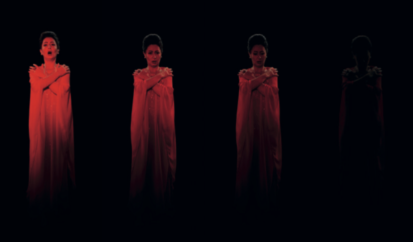
A bizarrely simple but beguiling and haunting piece that I found myself returning to 3 times and stays with you long after you leave the exhibition. The seance that the artists was looking for rather than a a performance or piece of theatre was certainly created for me. The location of the piece in the exhibition also adds to the atmosphere and mood. Cordoned off by a barrier you are forced to watch from afar as the hologram illuminates and appears towards the end of a long concrete corridor. The blood red colour at once love, warmth and danger again leave you on shifting sands at one minute embraced in the image the next a little disconcerted by it. This is added to by the is it it or isn't it real internal dialogue going on in your head as it looks hyper-real at times and at others you realise it is not. I feel this could have been played with more and could not help urging the hologram to glitch and shatter the illusion every now and again. The use of sound also immerses you as you watch it and never for a sceond do you not feel that it emitted from the hologram like a siren beckoning you in.
I am not too sure what the message of the piece was but for me it was to question your own senses as to the real and unreal, the comforting and scary. It played for me hugely on the uncanny that sense of nearly real but not quite and surfed this for the whole piece. It was a beautiful mood piece at once enchanting and almost threatening. As far as my own practice goes I loved the hologram technique and the way sound was excellently used as well as the importance of the exhibition space which alongside the image and sound was certainly a hugely important element.
KAHLIL JOSEPH: m.A.A.d. (2014)
Alternately intimate and epic, Kahlil Joseph’s dual-screen film installation m.A.A.d. brings together a range of source materials to create a prismatic portrait of the people and streets of Compton, a working class and largely African-American neighbourhood in Los Angeles. Made in response to Kendrick Lamar’s 2012 album good kid, m.A.A.d city, Joseph’s work incorporates home videos shot by the singer’s uncle in 1992, with news footage of police violence, and his own footage featuring scenes that veer from everyday life to magical realism and the macabre. For his soundtrack, Joseph remixed alternate takes from Lamar’s recording, distorting and cutting them in ways that augment the unexpected rhythms of his picture editing. With Lamar’s lyrics at times serving to provide pointed bursts of narration, the interplay between image and sound elaborates a complex, original and compelling vision of a contemporary African-American community.

This was a 2 screen piece and the duality of the screens was used well by Kahlil to juxtapose the two very different elements of life in and on the streets of Compton LA. Through my love of Hip Hop I am aware of Compton and the violence played out there but this piece to me took that as a starting point and then showed the other generally unreported aspects of that environment. The media tend to focus only on the sensational of danger of situations and this piece contrasted that with the behind the scenes real life too. The friendships, family, leisure and fun and joy that coexists there too and the two played (often side by side on the 2 screens) use the duality of these binary elements well. They actually heighten each other too as violence alongside violence carries less weight and comparison than violence against joy which highlights the difference and gulf between the two. Back to Eisenstein's montage theory and collision of images to create a new meaning but in this case to highlight the difference between the two. Images of gun toting youngsters, drive-bys, police being heavy handed and macho violence are placed next to hanging out at the pool, family get togethers and playing on the streets to create this. The simplicity of this works really well and the message to me at least was clear that both do coexist and that was what all communities were made of although it was amplified in this area with its difficulties.
As far as taking inspiration from the piece for my work I loved the idea of 2 screens and the duality it created to make two points that could contradict or compliment each other. Some of the installation had mirrored footage linking both screens which I thought worked really well and the use of the track and chopping to create a new version or interpretation i felt worked really well. At times this worked in parallel with the visuals but also at time was contrapuntal with hard music used over softer fun images or vice versa which continued the duality theme.
ELIZABETH PRICE: K (2015)
In this two-screen video installation Elizabeth Price brings together disparate elements – text, image, synthetic voice and a stark, percussive soundtrack – in a dense and complex exploration of collective emotion, performance and mechanised production. A ghostly stop-frame animation of the sun – created from thousands of glass plate slides taken between 1870 and 1948 – plays continuously on one of the two screens. On the other, a hypnotic CGI animation of the production of nylon stockings, each packaged under the brand name ‘K’, is interrupted or accompanied by footage of dancing performers, including 1970s country singer Crystal Gale. Binding these visual elements together is a narrative composed by Price and attributed to the Krystals, a fictional group of ‘professional mourners’. The synthetic voice – created using text-to- voice technology – describes the group’s highly ritualised practice, noting that ‘as sorrow has increasingly become contingent to all public and social affairs, any occasion of significance requires its proper acknowledgement.’

This piece left me a little cold and felt that there were too many elements all going on at the same time which confused the message to me. The feminist undertones, stocking, female performers and robotic femalesque voice led me to feel that this was the theme but there was a little too much to process. The piece in the notes above states "disparate elements " and this was how I felt about it, it almost needed some glue or a central element to bring it all together and make it more cohesive. There was too much going on and unlinked from text, image, synthetic voice and the stark, percussive soundtrack it all seemed too unfocussed. You could argue that the elements used do create a "dense and complex exploration of collective emotion, performance and mechanised production. " but certainly not for me. The piece seemes less than the sum of its parts which was disappointing.
I did like the use of 2 screens of different sizes and am obviously beginning to realise that the multi screen approach is still the one that seems to interest me. I have been critical of one screen installations in the past that they are a little flat and missing multi screened opportunities in my opinion but this point clearly illustrated to me that multi screens are fine BUT the content and assets have to right and serve the material.
UGO RONDINONE: THANX 4 NOTHING (2015)
Ugo Rondinone’s immersive video installation features legendary beat poet John Giorno performing THANX 4 NOTHING. In this poem written on his 70th birthday, Giorno looks back at his life – and the people and events that shaped it – with humour and compassion. Performing in a tuxedo and bare feet on an empty stage in the Palais des Glaces theatre in Paris, as well as in a brightly-lit TV studio, Giorno gives thanks to ‘everyone for everything,’ before speaking frankly on the death of friends and lovers, sex, betrayal and his frequent periods of depression. Rondinone’s carefully choreographed multi-screen installation – which features long shots, intimate close ups and passages of high-speed editing – keeps pace with Giorno’s theatrical delivery and draws attention to the poem’s many rhetorical twists and turns.


Loved, loved, loved this piece. A multi, multi screen installation that worked excellently with the material and the ideology of every character being multi-faceted with may guises. The installation was housed in a square room with a huge screen on each of the four walls but to add to this there were about 5 mini monitors placed on the floor. The audience sat in the middle of the room and the collective experience of watching it together and being immersed in the performance from every direction was a very satisfying one. The screens were all used independently but all following beat poet John Giorno's performance on his life and it's up and downs. Sometimes these did show the same image, sometimes they covered the performance from a multitude of angles and even shot sizes so often each one gave it's own perspective of what was being said. I found myself self editing the piece and looking for the most appropriate shot size dependent on what he was saying. Looking for a close up to see his emotion at the touching points but then when it got too personal looking for long shot to give him the space to reflect. The installation could have been overwhelming if you were bombarded with information but the narrative and theme was one idea not multiple ones so the fact that the performance was the central and only element allowed the use of multiple screens without confusing the message. they were all presenting the same message but just a different representation of in visually.

The use of mise-en-scene location wise was a theatre used sparingly as an into to re-emphasise the performance but a lot of it was theatrically lit with Giorno simply standing in a spotlight telling his story. The use of costume was interesting too with his 2 outfits a negative of each other black suit and tie white shirt or white suit and tie black shirt. I was trying to see if the happy parts were said in the white suit the darker in the black but could find no correlation and often a mix of outfits were on the different screens at the same time. Technically I would love to know how it was achieved as the lip synch is generally pretty good. The footage of him in different shot sizes in the same clothing could have all been shot at once on multiple cameras BUT then there were was also footage of him in the other clothing playing at the same time in-synch. More investigation needed here. The overall effect was stunning the use of technology, multiple screens, the environment of the room, a narrative and one central theme working all the senses worked excellently together and did capture the man, his times and also reflect that this was a journey we all travel but on different paths.
What I took from this piece were that it is possible to work on multiple screens I and not confuse your message. As long as there are not too many messages going on. One message on multiple screens here worked well. I would have loved to see more interaction between the screens though. in my Siblings piece the screens were interacting and talking with each other and this really added interest and feel that this may have been a wasted opportunity here. However it was a recording of Giorno's performance which may have had to be adapted to this. I do love the idea of the same character contradicting, arguing and colluding with themselves on multiple screens as a way of showing the multiple facets of character and perhaps this is an idea for me to explore and develop. The use of a screen on each wall I loved but did feel that the smaller monitor screens on the floor whilst adding a little would possibly not have been missed too much. I loved the idea of costumes in negative to represent two sides of a character and this was an idea that I myself have considered using and this piece did nothing but confirm that it could work well. I love the idea of using multiple screens and a lot of the works in the Infinite Mix and video installations generally often do not use or utilize the potential of this but Thanx For Nothing certainly did to the extreme but made it work. Loads of food for thought and the piece really stayed with me and was a huge inspiration.
RACHEL ROSE: EVERYTHING AND MORE (2015)
In Everything and More, US astronaut David Wolf narrates his experience of looking down on Earth from space and the sensory disorientation he experienced on his return. Accompanying Wolf’s disembodied narration is a visual collage that mixes galactic imagery with scenes shot in a neutral buoyancy laboratory where astronauts prepare for zero gravity, and footage of ecstatic crowds at an electronic music concert. The film’s galactic scenes were achieved with basic materials: milk, food-colouring, oil and water manipulated with an air compressor. In Everything and More, the micro and the macro, the sublime and the ordinary, are treated in much the same way: ‘as all, essentially, material.’ By projecting the film onto a fabric screen against a vinyl-covered window – which during the projection becomes alternately opaque and transparent – Rose creates subtle shifts in perspective and a form of sensory disorientation that brings us closer to Wolf’s own.

I am familiar with the work of Rachel Rose form her site specific Palisades exhibition at the Serpentine Sackler gallery that I visited last year that I really enjoyed. Rachel Rose treats the sound with as much care as the visuals in her work and this theme continued here with the David Wolf voice over and other interesting layers of sound. There were three main elements the space footage from the museum of artefacts as well as the zero gravity chamber, the footage of and EDM concert and the space themed imagery created with liquids a bit like the marbling technique I am sure everyone did at school but Rose used milk, food-colouring, oil and water manipulated with an air compressor. It was this imagery I found the strongest a bizarre fluid and ever changing universe-scape with tides and ebbs and flows constantly moving. If I had not been told it was created the way it was I would have believed that it was real footage as it was that otherworldly. This did also work well with the space suits and zero gravity footage which was much more documentary style and did of course also follow the space theme. The EDM concert footage to me did not gel, i was unsure of the point actually being made. Solitude and peace of space as opposed to a huge communal gathering of people? Technology to break frontiers or as entertainment? The ordinary and the extra-ordinary? To me the true concept and ideology was a little muddled and did feel like the EDM footage was a little shoe-horned in.
As far as ideas to take forward in my own work the idea of creating visuals using natural materials is an interesting one. Perhaps paint splats or drops or even water-coloured blobs could be used to visual demonstrate the notes and musical scales for my Amen piece. The piece left me a little cold I liked most of the elements but the central theme holding them all together as I mentioned was unclear. In my work I want to make sure that every element pays its way and earns its keep.
Overview of the Exhibition
I am still struggling to be able to appreciate video installation concepts as for me some of them seem either far too contrived, too highbrow or not as engaging as they could be in my opinion. Visually they can be strong as some of them were here but also they can seem like a collection of elements with not a strong enough central thread or too many ideas happening which muddy the water. It is a very fine line in my opinion between one and the other. Some I appreciated visually, many I appreciate technically and some I appreciated conceptually but very few in my opinion were able to do all three at once. This to me is the Holy Grail my aim and intention is to try and combine all of these elements in my work. For me the work that came closets was Thanx For the Memories, followed by OPERA: QM.15 then m.A.A.d. and WORK NO.1701. Quite a few in the Infinite Mix mis-fired for me though and my love/hate relationship with video installation work continues as does my concerns about my art practice within it. Still more questions than answers and is this really a medium I am happy working in and want to continue working in.
No comments:
Post a Comment