As well as the screens being used to screen the work I wanted to consider all of the other ways that I may be able to get across the main points of the significance of the Amen Break. One way to do it would be to somehow screen all of the names of the artists and their songs who had taken inspiration from it and appropriated, used and sampled it. The sheer heft and volume of these would be great to incorporate into the piece. The issue here was that there were a lot of them now over 2400. My piece as a compromise was going to use 1% of these so now 24 but this did lose the scale of the work that the break has influenced and could only give taster.
The sheer scale of trying to incorporate all of these was not lost on me. As text within the piece itself they would be far too fast on screen to drink in and as audio the same thing would happen, let alone the logistics of finding and including all of the songs that had used it. My considerations then moved to would it be possible to somehow include projections within the space that were a sort of animated wallpaper. They would not detract from the main installation piece but accompany it working at a lower level.
It was here and whilst researching ways to do this that I discovered the works of Hong Knog based artist Kinwah Tsang and in particular his Seven Seals. From his own website below are the notes on the concept and ideology behind it.
“The Seven Seals” is an on-going series of seven digital video installations using texts and computer technology to show Tsang’s thoughts on various issues of the day. “The Seven Seals” draws its reference from various sources including the Bible, Judeo-Christian eschatology, existentialism, metaphysics, politics, etc., which all attempt to articulate the complex situation of the world and the dilemmas that people are facing while approaching “the end of the world”.
Animated phases and short sentences appear and move and float, sometimes, like a murmur and sometimes like an admonition that reveals the nature of human beings and the changes of our emotions. The texts remind us of issues like war, terrorism, revolution, death, murder, suicide, self-denial, etc.
Without a clear beginning or end, each installation in the “The Seven Seals” creates different cycles of text on continuous loops that appear to repeat without end; echoing the concept of “eternal recurrence” whereby all the issues and dilemmas of daily existence are seen perpetually recurring for an infinite number of fleeting instances, even though we recognize and are aware of them for a much longer time.
I loved his work both aesthetically, and the dissemination and exhibition of it although I have not seem it in person the scale and audience immersion looks very apparent. The animated words and phrases and the multitude of ways he has used them dissolving, pull focus, tumbling from the ceiling, use of colour and composition all really excited and intrigued me. I especially loved the floor projections which look as if they were mapped and enveloped the space.
For my current piece this would be tricky to do due to time constraints the scale of doing this, focus on the main installation piece and space to house it in. However moving forward I feel a combination of this technique and the installation screen would work well in tandem. The installation to provide the visual and aural elements to explaining the story. This would allow the rest of the space the installation was housed in to communicate typographically in a Kinwah Tsang style the sheer volume of songs and artists that have used the break. This would envelop the audience and provide this information in a creative and interesting way but not detract from the main installation screen but complement it.
I have been greatly struggling with trying to create a good interesting visual interpretation of the visual with the aural for Amen Brother. I have been too hung up on multiple (three) screens as I love working on more than the one I am used to and last years siblings piece I felt was a breakthrough for me in combining these to make an immersive three screen installation. I am also trying to combine too many elements and ideas and it needs streamlining. As I have mentioned earlier I feel using 3 screens was leading me to feel that I had to use them all and this was leading to too many elements. Even when I started playing about with one (split) screen there was still a confusion of elements elements. these need stripping back. Some good advice from the crit was to settle on 2 ideas (3 maximum) and do these well. The main areas are obviously the story of the break and G.C. Coleman's story and the appropriation of the break and it's impact on music and popular culture. These are the essence of the piece and what needs to be communicated simply, cleanly and with a narrative and little enigma built in and the revelation moment if I can make it work.
With the anonymous idea I have been trying too hard to work from the stylistics outwards. I have become very hung up on the styles I want to try and learn, develop and incorporate and have been less successful in finding that essential to all documentary ideas the narrative and most importantly the character. My big bugbear with some works is that they are all style over substance and I felt that I was starting to fall into this trap. Techniques should support and enhance story, message and character not overwhelm it or be at the expense of these.
A breakthrough today came when I thought why not combine the two concepts/areas I was interested in. The Amen Brother piece had become too much about style and idea and not enough about narrative and character which had been lost somewhere in the process. The Amen break and G.C. Coleman has a strong character at it's centre who is currently not represented as strongly as I want and the same goes for the narrative and concept behind it. It also has a real documentary feel and a message that I am trying to communicate albeit a very subjective one. The protagonist of the piece the drummer G.C. Coleman is also pretty anonymous. A genius whose 6 second drum solo has inspired or been sampled and appropriated in over 2400 other pieces of music. This is getting lost by me being to be too clever and need re-instating.
Stylistically the techniques I have been researching and playing around with have been just style ideas as I have not found the substance for them yet. Animation, roto-scoping, double exposure etc are great techniques but just that if they are not serving the material and the idea. However these techniques could be very well suited to the Amen Piece piece. Most importantly they may provide the strong visual aesthetic I have been struggling to uncover for the piece. Rather than using three screens a simplified but more visually interesting one screen piece with stronger use of surround sound may provide the audience dissemination I have been striving for.
This is the ideas I want to take forward in the development of the piece.
Scrap the three screens for now.
Strip back to the key elements and lose all superfluous elements. Bring in the character G.C. Coleman's role and story.
Make more of a narrative, inception, history of the break and impact on music.throughout the piece. VO/text on screen?
Greater and more creative style and design. All too flat and caught up in lots of elements still to-date. Stripping back elements will aid this.
Play around with double exposure and roto-scoping techniques. Embrace After Effects.
More of my own footage. Loved the idea of appropriating all footage and shooting none of my own but need some footage from me. Drummer being the main one.
Does it have to be an installation? Am I moving towards an avant-garde, documentary, narrative film?
From my experiments with a single screen but with multiple almost montage elements still needed more visual interest and were a little flat. I began considering visually strong montagists and I thought of Robert Rauschenberg. I greatly admire his work and he is possibly in my opinion one of the more interesting Pop artists. I wanted to re-examine his work with the end game being an appropriation of his montage techniques, composition and use it as an inspiration for my own work. If it works on a single screen with imagery with in his later works 3D objects incorporated why not something similar on a single screen but also incorporating moving images?
A potted history was found online and this is an abridged version. Milton Ernest "Robert" Rauschenberg (October 22, 1925 – May 12, 2008) was an American painter and graphic artist whose early works anticipated the pop art movement. Rauschenberg is well known for his montages or what he called "Combines" of the 1950s, in which non-traditional materials and objects were employed in innovative combinations. Rauschenberg was both a painter and a sculptor and the Combines are a combination of both, but he also worked with photography, printmaking, papermaking, and performance. He was awarded the National Medal of Arts in 1993. He became the recipient of the Leonardo da Vinci World Award of Arts in 1995 in recognition of his more than 40 years of fruitful artmaking.
It is his earlier work and "Combines I am most interested in and his use of composition, colour, shape and almost use of layers using his silk screen printing to overlap images. Also he uses the the montage editing Eisenstein technique that “an idea that DERIVES from the collision between two shots that are independent of one another”. Rauschenberg however applied this to not film but the collision of images on his works to contrast, collude and create meaning for his audiences.
His two works above Untitled (1963) and Retroactive 1 (1964) are excellent examples of this. They deal with similar themes of space, exploration, adventure, courage and belief of those at the centre of it. They use a collage of elements to create this message. Using the hierarchy of design elements JFK is the strongest element as he was seen as being largely behind the US space race with the USSR by being bigger in one piece and centred in the other. the other elements do fight a little for second spot. In Retroactive 1 (1964) he juxtaposes the image of Kennedy with another photo silkscreen of a parachuting astronaut. The overlapping, and seemingly disparate composition, he also creates a colourful visual commentary on a media-saturated culture struggling to come to grips with the television era.
Left is Portrait of Merce (1984) which borrows a lot from his earlier "Combines" work. Frequently working as the stage manager for the Merce Cunningham Dance Company in its first decade, Robert Rauschenberg had a close, collaborative relationship with its founder. Borrowing techniques from his famous "Combines" series, "Portrait of Merce" features collaged fabric, paper, and drawings, juxtaposing artistic and everyday images in a colorful, vibrant composition.
It's use of colour is really bold and as well as Rauschenberg's common use of found photographic silk screen images he includes some line drawing work. Compositionally this is much more assymetrical in terms of balancing the imagery compared to the previously mentioned works. The use of colour is really inspirational and as my work has used either white or black backgrounds really shows what a bold use of colour can achieve. I also like the variety of shapes used in the piece with curves used as well as the squares and rectangles of his earlier works.
The pieces above are from his is Soviet/American Array series a later piece made in the late 1980's to early 1990's. Soviet/American Array VII is on the left and V is on the right. Rauschenberg sought to address the politics of peace constructively through art and friendship. He carried out his aims primarily in the Rauschenberg Overseas Culture Interchange (ROCI), which included research, exhibitions, and making connections with artists, critics, and poets in eleven countries. As part of ROCI, in 1989 Rauschenberg became the first American artist since World War II to be given a solo exhibition in the Soviet Union. For his Moscow show, Rauschenberg created the print series Soviet/American Array. The Russians invited him to exhibit in the Soviet pavilion at the Venice Biennial in 1990, and he became the first artist to represent a country other than his own in that venue.
Both utilised his earlier techniques but now rather than silk screen he was using a Photogravure approach using metal plates and photographic images. Again the themes of overlapping images, multiple photographic images and angular square shapes are repeated from his earlier work. What is different is his more bold approach to colour and even greater use of multiple images. I love the use of colour but the hierarchy of images is a little confused to me. It is hard to decipher which the stronger elements are and i feel that this is intentional and a holistic approach to all of the images to create a more unified meaning all contributing more or less equally to the overall sense of unity between east end west.
The ideas that I will take forward from Rauschenberg and experiment with to develop my one screen multiple elements work are outlined below. I will need to make sure that I take into account the use of moving images and sound in my work though but there is certainly plenty of food for thought here.
Using colour to differentiate images which I feel will add real visual interest to my work.
Overlapping of elements rather than separating them. this creates a weird cohesiveness to his work and could do to mine too.
The use of angular shapes (squares and rectangles) could work well with the assets and images I have currently been using.
The irregularity of shapes in the "Combines"compositions adds real interest and could allow me to play with the hierarchy of elements more.
The use of pop culture references is already present in my work through the music videos but can I be more creative with them?
The dictionary definition of kinetic typography is: noun [uncountable/countable] an animation technique involving moving text, usually accompanied by corresponding speech. '… Motion typography (or kinetic typography) refers to the art and technique of expression with animated text.
This pretty much sums it up but an excellent example and Dan Palmer, winner of a Student Design award from Canterbury Christ Church University. This makes excellent use of kinetic text, layout, size, colour, images and animation to communicate the speech on creativity. Bold colourful and creative it really shows off what the technique can achieve
The technique quite often works with speech using type and animations to illustrate what is being said in a complementary, fun and inventive way. It may also be just text but it tries to bring the words to life. The technique can be a little time consuming and you certainly want to have a basic storyboard and idea of how it will work on screen creatively before you get down to the technical aspects of creating it. It is a technique I have used before and created in Adobe After Effects and feel may work well with both the Anonymous piece and Amen Pieces I am developing. I have a little graphic design experience and training and as long as i do not stretch this too far feel that this will serve me well. Below are a collection of kinetic typography work that I feels works well for reference.
The piece below uses Charlie Chaplin's The Great Dictator speech and makes good use of effects, filters, movement and also imagery and animations to bring this to life. The timing is bang on and it really shows what is possible. It also demonstrates that if the speech is too fast then the typography can be a little overwhelming for the audience so something to watch here.
The video below is a clip from a movie about the snowboarder Travis Rice, Thats It, Thats All. As you can see it demonstrates how moving video and kinetic typography can be used in tandem. Truth be told not a great example but it does give some idea of how (and how not to) use the technique. The typography often obscures the images underneath and could be more sympathetic to them and work in tandem with them as often it is just a heavy handed overlay. Also it suffers on occasions when the visual and typography create overload in the audience and there is far too much to take in. Perhaps highlighting a few key words would be better. They have also avoided images my guess is because there are images underneath but I feel these could have been used and avoided a lot of the words on the screen. In places it works but if I decide to use this technique of typography AND moving image perhaps a clearer screen with room for this to happen, the images and typography working together and greater focus on composition are the lessons to take forward.
From the research and development of the two 3 screen installations, then the three attempts to get the split screen approach working there are clearly still issues. The playing around with all of the different elements has been helpful in so much as it has enabled me to see what is and is not working on a stylistic, contextual and ideological sense. However what is now needed is streamlining of these. I will outline these below and then state where I looking to go next in an attempt to address them. these are all the same questions stemming from both my own thoughts and those of my peers from crits.
TOO MUCH GOING ON IN TERMS OF IDEOLOGY AND MESSAGE.
This needs to be skinnied down and will hopefully lead to a clarity in terms of style too getting rid of elements. Ideas on religion, popular culture, represenatation, appropriation and sampling are clouding the key message that all these works were inspired by the genius of one person and 6 seconds of inspiration. I need to create a hierarchy of the key ideological elements and in my opinion they are in terms of hierarchy of the piece and constructing the message. These also need to be greatly reduced and I have outlined how I see this happening below and which elements are important in order of importance are below.
1: GC Coleman:
It is HIS story, HIS creativity that inspired the whole piece he needs to somehow have greater representation and play a stronger role. I need to look to get footage, photos or shoot re-enactments possibly so he and his fingerprints are all over the piece. 2: Contextualisation of artists who have used the break.
The appropriation of his work by the artists IS currently in the work and needs to stay in there. I have played around with the length of this clips and this is working in my opinion BUT they need to play a slightly more subsidiary role to GC himself. He has to somehow own them, or they be channeled through him somehow. This needs more investigation and testing as to what may be possible. 3: The revelation element to the piece
This is currently still not clear enough and I want to try and create that moment where the audience manage to piece the drummer, drum beat and songs using it all together and have the penny drop. The on screen type helps to clarify this but it needs to be subtle and drip feed the audience the message rather than an all out reveal..
A LACK OF CLARITY AND STYLE AND COHESIVENESS
The bottom line here is simply too many elements. However moving forward the knock on effect of the tightening of the ideology and message down to 3 central elements will also focus this. The visuals must somehow.
1: More GC Coleman as mentioned above he needs to be at the centre of the piece and represented all over it. Shooting re-aenactments, more use of photos etc may work but him, his figure, his playing, images of him need to be onmipresent in the piece. I am currently leaning towards shooting someone who looks like him playing the break.
2: Creatively present the artists and bands that have used the Amen break. Boxes are simply not doing this. Do I use music videos or perhaps record sleeves or a mixture? Do I need to show the whole of the music video as intended? Can I manipulate it? can I obscure, crop or distort them to make them more visually interesting.
3: Text or even voice over on screen to create a clean style to communicate the story. VO could be distracting from all of the other audio elements and text seems to be working. BUT keep it simple and sparse and short.
LACK OF STRUCTURE AND CLARITY OF MESSAGE
Currently this is not too present except in the split screen version 3 where I felt it was a huge leap forward in this test. Narrative and character are always really important to my work and these got a little lost.
1: Structurally there is not much going on and narrative need to be included. I love working with these and I feel a story being told will help the revelation and also provide a spine to hang all of the other elements on to.
2: The piece is a all a little cold at the moment and needs to have more of the character of GC Coleman included. Again are-enactments will get a lookalike to create some of this but also images could. he always seems to be smiling in photos and even looks a little cheeky and elements of this fun and character represented in the piece is greatly needed. This will incite empathy from the audience and make them feel for his story which does not end happily and pluck the old heart strings.
3: The information that needs to be communicated in the huge influence of the drum break that GC saw no money, recognition or acclaim for. This MUST be communicated more clearly for is the emphasis of the whole piece.
4: Appropriation and sampling debate. This is the least important and not even sure if it needs to be included as with clever use of narrative and text it could be implicit without being clunky and explicit.
Tweaking version 2 of the split screen approach a little I made some minor adjustments to see if I could iron out a few of the wrinkles in version 3. As before this was based on the outstanding issues I felt there was with the piece. Again I wanted to explore these quickly without spending lots of consuming time in After Effects so I did these tests again with variations of the assets I had already had in Premiere Pro. I now feel more convinced evermore that once elements, message and hierarchy clarified this is where I may finally compose the installation though.
A big plus is the use of the text to help to tell the story which not only gives a clarity of the message but also a narrative to follow and a little of the character of GC Coleman too and really gives some exposition. There are issues though as it is clunky, overlong, too descriptive, too much of it and it is fighting with all of the other elements BUT it does solve a lot of problems. This is definitely an element to pursue moving forward.
Content-wise it is still disappointing but reaffirmed that I need to go back to the drawing board with this but it is confirming that there is a hierarchy of elements and that some will need to go to streamline the piece. The main plus here though is the inclusion of the drummer which really helps solidify this area and strengthens it but I feel I need to make more and stronger use of this as it is the root of the whole piece. As far as the rest of the piece goes there is still simply too much going on conceptually, ideologically and style wise. I am hanging onto ideas as they took time to construct that are not serving the piece and creating a clarity of message towards my preferred meaning.
Style-wise I am still clinging onto the idea of screens, boxes and compartmentalisation of the elements as if I am working on 3 screens. More shape, creativity, colour and cohesiveness are needed as the piece looks simply like a collection of elements rather than a cohesive whole. This needs to be addressed moving forward.
The last critique was less than satisfactory but from feedback from this was well as my own screenings of my Stupidly I did not bring the single screen a version to the crit bit it did make me want to revisit this and play again with the hierarchy of elements. The following points and concerns were raised following my last version of the split screen approach and I wanted to explore these a little. Short of spending lots of consuming time in After Effects I wanted to do these tests again with variations of the assets I had already had in Premiere Pro. I feel that I do need to eventually once I get the elements, message and hierarchy clarified this is where I may finally compose the installation though to enhance the visual style of the piece if i go the one screen route which is looking more likely.
Greater use of the drummer in future places as it emphasises the drum element of the piece. Possibly incorporate as a stronger element more visually. Green screen and double exposure?
Music generally better shorter and the drums and similarities and were not the dominant element BUT music videos still a real diversion at times.
The AMEN animated built typeface from cover/sleeve tiles a little brash and blocky for some. I do agree to a point and these may need re-working.
Musical notes were leaving clues to the drums much better and were the dominant aspect for most of the time. Perhaps look again at different ays to interpret this though.
Visually OK but a little flat and graphical. Would be good to experiment more on layout, layers, overlapping and get the project and assets into Adobe After effects.
Still a little unsold on the single screen multiple elements approach and prefer the 3 screen piece and tests with this. Trying the above After Effects experiment may help ease off off this as perhaps too reliant on 3 screens from last year and having more than one screen to play with.
One screen installation test did go down pretty well against the 3 screens BUT I feel 3 screens shown large in the installation environment would be a different experience to it small on a computer screen.
Overall though the message was still not clear enough and a little confused to the audience I screened it to. Possibly too many elements or the lack of clarity through the narrative of hierarchy of elements. I do not really want to use explanatory text but it is possibly worth a go.
However upon explaining the piece the revelation did get a good response I just need to investigate how to create a clearer message within the piece.
Split screen version 2 did make small in roads into addressing some of the issues outlined above. Once again I screened it to a few friends and students to get their opinions. These are combined with my own thoughts below.
The greater use of the drummer did emphasise the drums theme more.
Same thoughts on the use of the animated musical notes AMEN cover/sleeve graphics as unchanged.
Graphically and visually the piece is very similar and will need attention and more creativity by importing the assets into After effects and manipulating and applying a stronger sense of design.
Single screen now working even better than the three screen approach in mine and their opinions.
Message still a little unclear and needs more clarification and perhaps the use of type or a VO may do this. I have resisted the idea of these but do need to test them.
A very interesting critique today and to put it honestly a little tough for lots of different reasons. Part of this project put me in a no-mans land of un-comfortability and lack of clarity seeking a path to the end of this project. I have been very outside of my comfort zone and tried to experiment as I have gone along and whilst the feedback was very constructive, has certainly proved to be food for thought and possibly suggest the way forward has made me seriously question my whole practice.
This is not a knee jerk reaction to some honest and to the point feedback but for a while I have been questioning my voyage of discovery into video installations and the world of fine art. I have been playing at it and it was interesting to work in this area last year so did not really stop to question if it was an area I wanted to work in this year and picked up where I left off. I dabbled last year and being curious found it interesting but it is not an area that I feel comfortable in or greatly enjoy. It is a mixture of doing with I think the MA Arts Practice wants to see, in a medium I know they are happy with and possibly meeting criteria rather than creating work in mediums and practice that really interest, stimulate and I have a real empathy with.
Three things really stand out from the critique. Firstly my current installation practice work does not really 100% excite me and therefore how can I expect it to excite and interest an audience. Secondly Val during her critique mentioned that is she 65 and she has about 10 years of hopefully good health and creating artworks in her. She had dabbled in lots of areas of practice and art disciplines and artforms but was going to focus in the time she had left on the area that interested her painting. the other areas were fun and distractions but she wanted to spend her time creating art that she enjoyed and wanted to create. lastly the most alive I have felt on the course this year was giving suggestions to Tara about her film noir comic book idea. I realised that this was where I became most enthused as it is the area of arts practice that excites me and one that I love with a passion. This being film and film-making.
I feel I have tried to shoehorn this a little into creating video installations and although found it interesting and something I may to return to but I feel the aim last year was to create one to get it out of my system and deal with my prejudice towards it and do something far removed from my practice to that point. I feel that now I have done an installation and exorcised that ghost it is almost a box ticked and now is time to move on. Lack of time, stress at work, laziness, comfortability and safety in continuing along this road and creating something that worked last time alongside other factors meant that I just fell into creating another video installation rather than choosing to do one.
I plan to get back to the core elements of my work and looking back at my I found I have strayed a little from the two core ones that are central to my work, character driven pieces with a strong narrative thread. This may take the form of and installation but I am going to work on a hybrid of sorts something that is a one screen piece that would work equally well on broadcast as an avant garde documentary or as possibly an installation.
The crit was an awkward one for me. I myself have not been fully happy with the stylistic direction and 3 screen installation medium I had been working on. I do however wholeheartedly believe in the idea and the story that I am trying to tell. The piece was again compromised a little due to it not being screened on 3 big screens which is my intention but it was projected fairly well and did give a fair idea.
Firstly screened some of my Siblings piece from last year as this contextualized where my practice was and where I was moving on from in the creation of the Amen Brother piece. This went down well and the audience were very engaged. I also said how painful the journey had been to create this stripped back version of a documentary and to leave all the bells and whistles along the way to get the purity of this piece. Looking back the irony of these comments was not wasted on me when I got feedback on Amen Brother!
Next I screened V2 of Amen Brother which was the 3 screen installation version. I decided not to bring the single screen trials I had been experimenting with which looking back seems stupid as it would have been great to show them this too. I did not want too much of an introduction to the piece and wanted to see if it could stand on it's own two legs so screened it without too much of an introduction. We then discussed it and the feedback is outlined below and the main issue was that most of them did not get the preferred reading or the concept and message I was trying to communicate. Even those who were at the big crit (Emily and Val) and understood my intentions still did not feel the message was clear enough and communicated. Following the discussion and explanation of the piece I screened the work again and the audience did now pick up all the clues and appreciate the intentions.
The general feedback from my peers is below with my thoughts on this underneath.
The piece was overcrowded with too many focal points and too much happening. Strip back for audience. 1-2 key elements so simplify.
This I do agree with. from the installations I have seen though I have felt that they were a little too slow and dare I say it lazy and boring. I like having lots of interest but if this is detrimental to the message I will have to re-think. My work with single split screens and design hierarchy of elements may be the way to go and I agree that at times I am simply looking for content to fill there screens NOT just simply using the right content.
The use of the drummer was good and possibly try and incorporate this more. Foundations and inspiration of the piece is the drums and drummer.
Daft one to miss this and I 100% agree. The drummer and the drum solo are the very centre of the piece and are the DNA for everything else on screen so of course they should be more integral to it and play a much bigger role. Possibly combining images and drumming using templates and effects rather than a drummer simply playing would work?
Too many themes and ideologies going on and this confuses the message. Music, pop culture, religion, appropriation, pop icons, representation etc.
I love the idea of this and of art asking questions and causing debate thought, speculation and discussion which is surely one of its main purposes so this left me a little confused. My thinking is that due to the multiple messages and readings the preferred reading is getting lost. Perhaps if I keep with this approach of many messages a hierarchy of ideology is needed so the celebration and acknowledgement of the influence of the drum solo and GC Coleman is front and centre. Then the other issues for consideration more in the background. However am I putting too much in? Are the other ideologies elements merely misdirection and red herrings? More thinking needed here definitely. This is also leading to the use of multiple assets and content which as mentioned earlier is bombarding the audience with possibly too much information.
Were 3 screens really needed? Simply holding on to Sibling pieces idea? Would one screen be a better option?
Very good point here and I agree. It is a mixture of laziness, trying to create installations to be more Arty in my Practice to satisfy expectations I feel the course has put on my work (rightly or wrongly) and sticking with the safety of a medium and technique that is tried and tested and I know I can make work. I am going to have to experiment more and as mentioned earlier I wish I had brought the one screen split screen test version I have been playing around with to screen to them. Possibly three screens with so much differing content is too much and too diverting and it is hard to do without giving each screen a fairly equal balance. Possibly one screen is a better way to go. Experimenting with documentary more for TV or single screen installations and playing around with scale, form and hierarchy of the elements is certainly the way to go.
The revelation aspect I was aiming for was not there. However the piece did work better second time round once the concept was explained.
Still not there first time and am I getting too hung up on this. can i use narrative more to try and clarify this but drip feeding it so there is a revelation that way. Is a revelation needed. Could it be an aural one when the audiences ears finally tune in to the drum beat only and the penny drops? The use of the word Amen was unclear and possibly carries too much weight and significance. Possibly use The Amen Break? The theme of worship comes across strongly due to the word Amen. Worship of pop icons/culture?
Fair point and certainly worth looking into. I have become a little entrenched with the word as I love all of the connotations nit brings with it but perhaps this is muddying the water too much and less could be made of it. One of my original ideas was to use the break to comment on the different huge amount of different religions 4200+ compared to the Amen Breaks 2300+ usages. I was going to use the Amen break to braw parallels between these and perhaps I am still hanging onto this subconsciously. Amen means "so be it".
As far as worship of pop culture and pop icons goes this is perhaps as mentioned earlier a layer of ideology too far and is confusing the preferred reading. Once again as I mentioned earlier also though surely art posing and asking questions and causing debate thought, speculation and discussion is not such a bad thing and one of the main points of it.
Audio first and then visuals approach as mine seemed to be the other way round. Quote from sound designer on Eraserhead/David Lynch. More experimentation with audio. Overlapping, crash edits, speed, manipulation etc. Audio only piece? Collaborate with a sound expert to see what is possible.
IU am first and foremost someone who works with and is comfortable with the moving image and sound generally plays second fiddle to this so there is a definite point in here. The thought of flipping this on its head and doing sound first image later is scary and also problematic as some of the sound and image is linked (music videos) and sinking picture to them afterwards is a nightmare. However it is something I need to explore. An audio only piece is worth looking into but my love of the moving image I feel needs to be in there somewhere. But starting from scratch with the audio first and then visuals later is certainly worth a try.
I have a little bit of a tin ear and whilst appreciating sound am not as comfortable in this area as with the moving image. I have done some tests but my appreciation and knowledge left me a little short so possibly more research would help here. Further experimentation would be good though and collaborating with friends who are more comfortable with sound is a great idea. Make the message clearer. Use text on screen for a little exposition to get audience up to speed and fill in the gaps. Also more on the story as this is really interesting GC Coleman and the subject is really interesting.
Very, very strongly agree. Somewhere amidst all the elements this has been forgotten a little. This the whole point of the piece but as well as that the story is really interesting and the character and narrative elements of the man behind it have been lost. These need reinstating. Possibly VO, on screen graphics/titles or more in the way of details in the gallery/ More thought and testing needed. The issue of ethics was raised legality etc of using these clips. Was it my own work or a collection of the work of others?
The concept of the appropriation art movement did not seem to be grasped by the group and the impression that I got was that I was just collecting elements and re-purposing them and how much of the work was then my own. I did explain the ideology was the celebration of the genius of one unsung hero but also the irony of using appropriation to do this by re-appropriating the creative work of others who had appropriated from him. I feel this needs to be stronger and possibly gallery notes would help this or stronger pointing to this in the piece. I explained I had researched the legal and ethical considerations and felt I was within them. The visual style was very formal and could be more creative. Possibly crop of distort the music videos as these were the most arresting and attention catching images. The piece was not all that different from the last version screened at the Big Crit. Possibly drastic rethinking of how to communicate the idea is needed.
I have mentioned this above and agree to some extent it is very format, boxy and could be more creative and freeform and this may suit the content better. If I move away from from three screens it does open a lot of doors. Some of the assets and content are working or are close to working there BUT visually it is a little uninteresting. I have been looking into techniques and approaches and maybe combining these with this piece may work. Also playing around more in After Effects, on one screen and with filters and effects would be the way forward.
Following on from the feedback from the first critique I dissected, considered and ruminated on this to take forward into a newer version that hopefully would move towards resolving some of the issues that the audience had with the piece.
A lot of the concerns were concerns I had myself highlighted. The major over-riding concern was the fact that no-one came even close to making the connection so this MUST be stronger and the visuals could be used to highlight this more. Lots more trialling, action research and testing to develop the piece. Also to consider the use of the three screens interacting more and being more active (especially the middle one) and possibly conflicting with each other for attention. Also the theme of the Amen Break linking all of what is happening and making the ideology of the piece clearer.
I wanted to play around with the elements I had as felt that from my feedback from the big crit a lot of them were working. What I wanted to do was to try and make the piece more cohesive and make sure I really sold it and communicated the message and themes I wanted to.
Here is version Amen Brother Version 2
In my opinion I feel that the message is much clearer on this second version. I decided to keep some of the elements similar or the same The shortening of the clips of uses of the Amen Break by other artists have been shortened so the drum break has more of a flowing nature linking them all together. The inclusion of the developed animated musical score to me also links all the elements together as you can follow the drum beat in all of the tracks clearly illustrating their common drum beats. I have also included an image of the drummer himself G.C. Coleman to bring him more front and centre.
I decided to keep the three screens for this version to see if I could get them working well together but must be careful not to have them just for the point of it and filling them to make sure they are used if the piece does not dictate it. I like the busy nature of the piece as in a lot of installations I have seen I am generally unimpressed with what I perceive to be the lack of interest going on in them. I appreciate that less can be more in some instances but from having worked principally on one screen for my TV work I love the liberation of multiple screens. I do also feel that the screening of it as it is above and not on three big screens as intended compromises the piece and due to the small images deadens its impact.
I also like the idea of a busy piece and plenty happening and drawing on lots of themes. Religion, appropriation, copyright, sampling, post-modernism, representation and idolatry of pop icons, words (song titles) building narrative, unsung heros, accidental movements, sound as memory, audience consumption and also the idea of revelation of discovery at the theme of the piece. As I write this I am concerned that this is too much but I guess people may be able to pick what they like out of it. There is a concern that this may confuse or overload the audience but I want to trial it again and see if the message is clearer if the audience will not be engulfed in too much visually and aurally.
My interaction and viewing of Video Installations has been poor of late so I decided that I needed Also a great many of my peers who have viewed the exhibition pointed me towards it as something I had to see working in the medium I was so I made my way to London to catch it. I have mentioned may times before that my relationship with video installation work was a little marmite struggling with most of the work I have seen. Also I am at a bit of a crossroads in my own practice and not sure if this was the medium to move forward in. I enjoyed working within it for my Siblings piece last year and the empowering idea of using more than one screen but it feels a little forced on my current piece. So it was with excitement and trepidation I travelled to The Store on the Strand to see the pop up, off site Hayward Gallery exhibition.
The exhibition billed itself thus on its promotional materials. "The Infinite Mix: Contemporary Sound and Image brings together audiovisual artworks that are soulful and audacious in their exploration of a wide range of subjects. In all of the works in this exhibition the interplay between moving image and sound is crucial. Most of the artists have composed, commissioned or remixed soundtracks that relate to the visual element of their work in unexpected ways, and ensure that what you hear is just as important as what you see.
The Infinite Mix includes works that address tumultuous histories and cultural tensions in ways that are thought-provoking as well as deeply entertaining. They also pointedly remix our notions of history and fiction, the real and the staged, and the sublime and the everyday. Drawing on varied genres including documentary filmmaking, music video, experimental film and theatrical performance, these artworks dispense with straightforward storytelling and unfold in a manner akin to musical compositions. Together, they expand the ways in which we experience moving images and sound, and open up new veins of meaning in art’s potentially ‘infinite mix.’"
The mix and important link of sound and visuals in all the pieces and variety of genres certainly whet my appetite and I was greatly looking forward to seeing what I may be able to glean from the exhibition. The examples of work on show were also interesting as they were all very contemporary from the last 3 years. It would be a great barometer of what is happening in the world of video installation in terms of content, exhibition and dissemination, aesthetic, audience interaction and technologically.
The first thing that really struck me was the exhibition space. A what seemed to be a store/office space had been converted into 10 bespoke studio space environments each well suited to the audio visual installations housed within. Video installations are often shoe-horned in or feel a little ill at ease to me in a gallery environment and the purpose built converted spaces of the installations I felt worked well. Equally the fact that they were all audio visual pieces enhanced the cohesiveness of the exhibition and the contemporary feel of it. This was backed up well by Alex Eagle, Creative Director of The Store and responsible for the exhibition "The future of all space is both the physical experience of being in that space and broadcasting that experience to the world."
The work was a mixed bag and due to time and queues unfortunately I did not have time to visit all 10 of the pieces on display.
What follows is the catalogue description of the each of the pieces of work that left an impression on me followed by my own thoughts on the pieces and how they inspired, influenced me or left me frustrated or exhilarated.
MARTIN CREED: WORK NO.1701 (2013)
Martin Creed’s work often focuses on a single movement or gesture. In Work No. 1701 a range of individuals cross a New York street, accompanied by a jubilant pop song written and performed by the artist. Talking about the film, Creed has commented that ‘doing things in life, living and working, is always using your body’, and that ‘life can look like a dance’. Work No. 1701 is a celebration of the act of getting from A to B, as well as the different ways in which people move through the world.
Creed, who has been writing songs and leading a band for over 20 years, describes his music and his visual work as an ‘attempt to make something for the world’. As he explains, they both stem from the same place: the desire to ‘say hello, to try to communicate somehow.’
I loved the simplicity of this work and the variety of characters and emotions the simple idea was able to conjure up. From able bodied to disabled, young to old the piece created an interesting narrative. The effect was looped and as mentioned shot over a long period of time at the same location and the repetitiveness of the action drew attention to the characters as they were all performing the same basic task so the emphasis became HOW they completed the task. The music worked really well and in spite of the challenges many of the participants faced the piece remained upbeat and a celebration of them and their differences and all of us and our differences. It was screened on one screen and this did work but possibly could have been mixed up with split screens to add more interest as it was repetitive and visually not all that interesting after a while BUT as I mentioned earlier this felt like the point it took the location and other visual stimulus out of the equation so you did concentrate fully on the participants. Less possibly being more and the simplicity of visual and aural content to communicate ideas is what I took from the piece and is something I have always struggled to do.
STAN DOUGLAS: LUANDA-KISNSHASA (2013)
Shot like a documentary film on a set carefully crafted to resemble a legendary New York recording studio, Stan Douglas’s Luanda-Kinshasa depicts a fictional 1970s jazz-funk band engaged in a seemingly endless real-time jam. The band’s music echoes the then-current confluence of American jazz, funk and Afrobeat – a musical fusion made possible, as the video’s title indirectly implies, by the emerging independence and rising profile of African nations.
As the camera appears to seamlessly circle around the studio, the sound mix highlights whichever musician it lingers on, enhancing the impression that we are watching a live performance. But the band’s improvisation is actually a construction: intricately remixed by Douglas in the editing room, it extends through over six hours of ‘alternate takes’ created by recombining various shots and accompanying sections of music. Conjuring a never-ending sequence of variations, Luanda-Kinshasa conjures a vision of culture as a potentially ‘infinite mix.’
This was an interesting piece and I really loved the ideas behind it. To me though the point was somehow misplaced and it felt a little like a clever technical exercise of the continuous jam and combining of all of the sound takes from multiple tracks to create this. I did not take much away from the piece on the themes it was apparently trying to communicate as the messages got lost in the spectatorship of the band actually playing. The African afrobeat link was lost on me and the idea of emerging African nations message was not sold to me anyway. It was displayed on a single screen and looked great and the sound, camera movements and editing were very polished. The mise-en-scene and the depth and detail to it were excellent though from the location to the props but especially the costumes which were truly something to behold! I loved the techniques used and could appreciate them but what i took for my own work moving forward was that technique is just that it is the communication of the idea that is important and the technique in my opinion should be subservient to the concept and ideology. The piece did impress upon me the joy of excellent sound though as this was
DOMINIQUE GONZALES-FOERSTER: OPERA: QM.15 (2016)
In the holographic illusion OPERA (QM.15) Dominique Gonzalez-Foerster appears in the guise of legendary soprano Maria Callas (1923–77). Dressed in the singer’s signature red dress and dramatic makeup, the artist lip-syncs to arias from Cherubini’s Medea, Verdi’s La Traviata and Ponchielli’s La Gioconda. Situated at the end of a derelict corridor, and encountered from a distance of 30 metres, the luminous figure is at first startlingly life-like – an impression reinforced by the strength of Callas’s voice.
OPERA (QM.15) is influenced by the development of photography, early cinema and the interest in the uncanny shared by many 19th-century artists and writers. It is related to a larger body of work that Gonzalez-Foerster began in 2012: an ever-expanding ‘fragmented opera’ consisting of live and recorded performances in which she appears as a range of fictional or historical figures. To Gonzalez-Foerster, each performance – including her turn as Maria Callas – is not theatre, but rather ‘a kind of séance.’
A bizarrely simple but beguiling and haunting piece that I found myself returning to 3 times and stays with you long after you leave the exhibition. The seance that the artists was looking for rather than a a performance or piece of theatre was certainly created for me. The location of the piece in the exhibition also adds to the atmosphere and mood. Cordoned off by a barrier you are forced to watch from afar as the hologram illuminates and appears towards the end of a long concrete corridor. The blood red colour at once love, warmth and danger again leave you on shifting sands at one minute embraced in the image the next a little disconcerted by it. This is added to by the is it it or isn't it real internal dialogue going on in your head as it looks hyper-real at times and at others you realise it is not. I feel this could have been played with more and could not help urging the hologram to glitch and shatter the illusion every now and again. The use of sound also immerses you as you watch it and never for a sceond do you not feel that it emitted from the hologram like a siren beckoning you in.
I am not too sure what the message of the piece was but for me it was to question your own senses as to the real and unreal, the comforting and scary. It played for me hugely on the uncanny that sense of nearly real but not quite and surfed this for the whole piece. It was a beautiful mood piece at once enchanting and almost threatening. As far as my own practice goes I loved the hologram technique and the way sound was excellently used as well as the importance of the exhibition space which alongside the image and sound was certainly a hugely important element.
KAHLIL JOSEPH: m.A.A.d. (2014)
Alternately intimate and epic, Kahlil Joseph’s dual-screen film installation m.A.A.d. brings together a range of source materials to create a prismatic portrait of the people and streets of Compton, a working class and largely African-American neighbourhood in Los Angeles. Made in response to Kendrick Lamar’s 2012 album good kid, m.A.A.d city, Joseph’s work incorporates home videos shot by the singer’s uncle in 1992, with news footage of police violence, and his own footage featuring scenes that veer from everyday life to magical realism and the macabre.
For his soundtrack, Joseph remixed alternate takes from Lamar’s recording, distorting and cutting them in ways that augment the unexpected rhythms of his picture editing. With Lamar’s lyrics at times serving to provide pointed bursts of narration, the interplay between image and sound elaborates a complex, original and compelling vision of a contemporary African-American community.
This was a 2 screen piece and the duality of the screens was used well by Kahlil to juxtapose the two very different elements of life in and on the streets of Compton LA. Through my love of Hip Hop I am aware of Compton and the violence played out there but this piece to me took that as a starting point and then showed the other generally unreported aspects of that environment. The media tend to focus only on the sensational of danger of situations and this piece contrasted that with the behind the scenes real life too. The friendships, family, leisure and fun and joy that coexists there too and the two played (often side by side on the 2 screens) use the duality of these binary elements well. They actually heighten each other too as violence alongside violence carries less weight and comparison than violence against joy which highlights the difference and gulf between the two. Back to Eisenstein's montage theory and collision of images to create a new meaning but in this case to highlight the difference between the two. Images of gun toting youngsters, drive-bys, police being heavy handed and macho violence are placed next to hanging out at the pool, family get togethers and playing on the streets to create this. The simplicity of this works really well and the message to me at least was clear that both do coexist and that was what all communities were made of although it was amplified in this area with its difficulties.
As far as taking inspiration from the piece for my work I loved the idea of 2 screens and the duality it created to make two points that could contradict or compliment each other. Some of the installation had mirrored footage linking both screens which I thought worked really well and the use of the track and chopping to create a new version or interpretation i felt worked really well. At times this worked in parallel with the visuals but also at time was contrapuntal with hard music used over softer fun images or vice versa which continued the duality theme.
ELIZABETH PRICE: K (2015)
In this two-screen video installation Elizabeth Price brings together disparate elements – text, image, synthetic voice and a stark, percussive soundtrack – in a dense and complex exploration of collective emotion, performance and mechanised production. A ghostly stop-frame animation of the sun – created from thousands of glass plate slides taken between 1870 and 1948 – plays continuously on one of the two screens. On the other, a hypnotic CGI animation of the production of nylon stockings, each packaged under the brand name ‘K’, is interrupted or accompanied by footage of dancing performers, including 1970s country singer Crystal Gale.
Binding these visual elements together is a narrative composed by Price and attributed to the Krystals, a fictional group of ‘professional mourners’. The synthetic voice – created using text-to- voice technology – describes the group’s highly ritualised practice, noting that ‘as sorrow has increasingly become contingent to all public and social affairs, any occasion of significance requires its proper acknowledgement.’
This piece left me a little cold and felt that there were too many elements all going on at the same time which confused the message to me. The feminist undertones, stocking, female performers and robotic femalesque voice led me to feel that this was the theme but there was a little too much to process. The piece in the notes above states "disparate elements " and this was how I felt about it, it almost needed some glue or a central element to bring it all together and make it more cohesive. There was too much going on and unlinked from text, image, synthetic voice and the stark, percussive soundtrack it all seemed too unfocussed. You could argue that the elements used do create a "dense and complex exploration of collective emotion, performance and mechanised production. " but certainly not for me. The piece seemes less than the sum of its parts which was disappointing.
I did like the use of 2 screens of different sizes and am obviously beginning to realise that the multi screen approach is still the one that seems to interest me. I have been critical of one screen installations in the past that they are a little flat and missing multi screened opportunities in my opinion but this point clearly illustrated to me that multi screens are fine BUT the content and assets have to right and serve the material.
UGO RONDINONE: THANX 4 NOTHING (2015)
Ugo Rondinone’s immersive video installation features legendary beat poet John Giorno performing THANX 4 NOTHING. In this poem written on his 70th birthday, Giorno looks back at his life – and the people and events that shaped it – with humour and compassion. Performing in a tuxedo and bare feet on an empty stage in the Palais des Glaces theatre in Paris, as well as in a brightly-lit TV studio, Giorno gives thanks to ‘everyone for everything,’ before speaking frankly on the death of friends and lovers, sex, betrayal and his frequent periods of depression.
Rondinone’s carefully choreographed multi-screen installation – which features long shots, intimate close ups and passages of high-speed editing – keeps pace with Giorno’s theatrical delivery and draws attention to the poem’s many rhetorical twists and turns.
Loved, loved, loved this piece. A multi, multi screen installation that worked excellently with the material and the ideology of every character being multi-faceted with may guises. The installation was housed in a square room with a huge screen on each of the four walls but to add to this there were about 5 mini monitors placed on the floor. The audience sat in the middle of the room and the collective experience of watching it together and being immersed in the performance from every direction was a very satisfying one. The screens were all used independently but all following beat poet John Giorno's performance on his life and it's up and downs. Sometimes these did show the same image, sometimes they covered the performance from a multitude of angles and even shot sizes so often each one gave it's own perspective of what was being said. I found myself self editing the piece and looking for the most appropriate shot size dependent on what he was saying. Looking for a close up to see his emotion at the touching points but then when it got too personal looking for long shot to give him the space to reflect. The installation could have been overwhelming if you were bombarded with information but the narrative and theme was one idea not multiple ones so the fact that the performance was the central and only element allowed the use of multiple screens without confusing the message. they were all presenting the same message but just a different representation of in visually.
The use of mise-en-scene location wise was a theatre used sparingly as an into to re-emphasise the performance but a lot of it was theatrically lit with Giorno simply standing in a spotlight telling his story. The use of costume was interesting too with his 2 outfits a negative of each other black suit and tie white shirt or white suit and tie black shirt. I was trying to see if the happy parts were said in the white suit the darker in the black but could find no correlation and often a mix of outfits were on the different screens at the same time. Technically I would love to know how it was achieved as the lip synch is generally pretty good. The footage of him in different shot sizes in the same clothing could have all been shot at once on multiple cameras BUT then there were was also footage of him in the other clothing playing at the same time in-synch. More investigation needed here. The overall effect was stunning the use of technology, multiple screens, the environment of the room, a narrative and one central theme working all the senses worked excellently together and did capture the man, his times and also reflect that this was a journey we all travel but on different paths.
What I took from this piece were that it is possible to work on multiple screens I and not confuse your message. As long as there are not too many messages going on. One message on multiple screens here worked well. I would have loved to see more interaction between the screens though. in my Siblings piece the screens were interacting and talking with each other and this really added interest and feel that this may have been a wasted opportunity here. However it was a recording of Giorno's performance which may have had to be adapted to this. I do love the idea of the same character contradicting, arguing and colluding with themselves on multiple screens as a way of showing the multiple facets of character and perhaps this is an idea for me to explore and develop. The use of a screen on each wall I loved but did feel that the smaller monitor screens on the floor whilst adding a little would possibly not have been missed too much. I loved the idea of costumes in negative to represent two sides of a character and this was an idea that I myself have considered using and this piece did nothing but confirm that it could work well. I love the idea of using multiple screens and a lot of the works in the Infinite Mix and video installations generally often do not use or utilize the potential of this but Thanx For Nothing certainly did to the extreme but made it work. Loads of food for thought and the piece really stayed with me and was a huge inspiration.
RACHEL ROSE: EVERYTHING AND MORE (2015)
In Everything and More, US astronaut David Wolf narrates his experience of looking down on Earth from space and the sensory disorientation he experienced on his return. Accompanying Wolf’s disembodied narration is a visual collage that mixes galactic imagery with scenes shot in a neutral buoyancy laboratory where astronauts prepare for zero gravity, and footage of ecstatic crowds at an electronic music concert.
The film’s galactic scenes were achieved with basic materials: milk, food-colouring, oil and water manipulated with an air compressor. In Everything and More, the micro and the macro, the sublime and the ordinary, are treated in much the same way: ‘as all, essentially, material.’ By projecting the film onto a fabric screen against a vinyl-covered window – which during the projection becomes alternately opaque and transparent – Rose creates subtle shifts in perspective and a form of sensory disorientation that brings us closer to Wolf’s own.
I am familiar with the work of Rachel Rose form her site specific Palisades exhibition at the Serpentine Sackler gallery that I visited last year that I really enjoyed. Rachel Rose treats the sound with as much care as the visuals in her work and this theme continued here with the David Wolf voice over and other interesting layers of sound. There were three main elements the space footage from the museum of artefacts as well as the zero gravity chamber, the footage of and EDM concert and the space themed imagery created with liquids a bit like the marbling technique I am sure everyone did at school but Rose used milk, food-colouring, oil and water manipulated with an air compressor. It was this imagery I found the strongest a bizarre fluid and ever changing universe-scape with tides and ebbs and flows constantly moving. If I had not been told it was created the way it was I would have believed that it was real footage as it was that otherworldly. This did also work well with the space suits and zero gravity footage which was much more documentary style and did of course also follow the space theme. The EDM concert footage to me did not gel, i was unsure of the point actually being made. Solitude and peace of space as opposed to a huge communal gathering of people? Technology to break frontiers or as entertainment? The ordinary and the extra-ordinary? To me the true concept and ideology was a little muddled and did feel like the EDM footage was a little shoe-horned in.
As far as ideas to take forward in my own work the idea of creating visuals using natural materials is an interesting one. Perhaps paint splats or drops or even water-coloured blobs could be used to visual demonstrate the notes and musical scales for my Amen piece. The piece left me a little cold I liked most of the elements but the central theme holding them all together as I mentioned was unclear. In my work I want to make sure that every element pays its way and earns its keep.
Overview of the Exhibition
I am still struggling to be able to appreciate video installation concepts as for me some of them seem either far too contrived, too highbrow or not as engaging as they could be in my opinion. Visually they can be strong as some of them were here but also they can seem like a collection of elements with not a strong enough central thread or too many ideas happening which muddy the water. It is a very fine line in my opinion between one and the other. Some I appreciated visually, many I appreciate technically and some I appreciated conceptually but very few in my opinion were able to do all three at once. This to me is the Holy Grail my aim and intention is to try and combine all of these elements in my work. For me the work that came closets was Thanx For the Memories, followed by OPERA: QM.15 then m.A.A.d. and WORK NO.1701. Quite a few in the Infinite Mix mis-fired for me though and my love/hate relationship with video installation work continues as does my concerns about my art practice within it. Still more questions than answers and is this really a medium I am happy working in and want to continue working in.
Applying my research to my own work I tried a variety of combinations of the assets I had already created to experiment with these. I have as mentioned in an earlier post adapted the music used since version one and drastically cut the music down (nearly halved) and focussing more on the sections of the tracks that had sampled the Amen break. The piece was still not a full version but a partial version as I aim to have 24 tracks in total which is 1% of the 2400 tracks that have used it. I also had in my head a hierarchy of importance placed on the elements and applying the theory of this concept I drew the following conclusions of my preferred reading of the piece which is below.
I considered the musical notes to be the most important. They were the graphical representation of the Amen Break and the thread that tied all of the other elements together. Following the hierarchy of design elements for this reason I wanted them to dominate the split screen. As this was just an initial trial and to save time I decided to work with them as they were. From their construction and a little re-sizing I was able to make them half a screen sized and positioned them on the top half of the screen where they had prominence. I did do tests with a completely white background and white top half and black bottom half and found the latter was stronger. There is movement in the animated musical notes they do attract the attention also. This element may need work as it is not the most visually interesting but I still feel that it works as a reference to the roots of all of the songs used and ties them together. The musical notes were only on screen when the Amen break was happening in the track as I felt that they were a little flat visually to be on screen the whole time. These were broken up by the animated covers/sleeves either the Winston's covers animated spelling out AMEN and flashing or the word AMEN built from the covers of all of the bands who had used or sampled the track. This did add interest and I felt in a strange way drew the attention more to the scales and notes when they were on screen. The contrast here of the white of the scales (as mentioned earlier) to the black of the AMEN covers catching the eye.
Next were the music video clips these not only provided the all important sound but contextualised the music notes and the drum patterns. They helped to show the variety of artists and musical genres that had used the Amen Break as well as being ironic as they are being appropriated just as the Amen Break had been appropriated to aid their creation. As an added bonus they are also visually rich and add strong visual interest to the piece. These were from the big crit feedback the most diverting and attracting element to the audience on the early version of the piece. I still felt that these were important and wanted to use them but by making them smaller, (about 50%) I felt they took less of the audience attention with more focus on the scales. I wanted to get some interaction with the audience though so decided to alternate these between the bottom (therefore less prominent) left and bottom right with the song titles to maintain interest. This works much better in my opinion and balances the strong visuals of the music videos to the size and positional dominance of the scales.
Third were the song titles and the record covers/sleeves. I felt that these were more of a visual clue than anything else but did cement the artists and the variety of musical artists and genres who had used the Amen Break. By being smaller and a constant in the middle of the bottom half of the screen as well as static graphics they are present an there for interest but do not divert from the strongest elements compositionally.
Lastly were the song titles. I feel these were not 100% necessary due to the inclusion of the record covers/sleeves. However for balance to the piece in the lower half of the screen I felt they worked well and added another clue for the audience to the enigma of what the tracks were and the contextualisation of these. I used a plain white font Helvetica on the black background so as not to draw too much attention to them. I also liked the fun element of the track names and the way they muddied water this may add to those unfamiliar with the tracks and the weird narrative they sort of built.
Overall thoughts moving forward and from feedback from a few friends and students are as follows.
Greater use of the drummer in future places as it emphasises the drum element of the piece. Possibly incorporate as a stronger element more visually. Green screen and double exposure?
Music generally better shorter and the drums and similarities and were not the dominant element BUT music videos still a real diversion at times.
The AMEN animated built typeface from cover/sleeve tiles a little brash and blocky for some. I do agree to a point and these may need re-working.
Musical notes were leaving clues to the drums much better and were the dominant aspect for most of the time. Perhaps look again at different ays to interpret this though.
Visually OK but a little flat and graphical. Would be good to experiment more on layout, layers, overlapping and get the project and assets into Adobe After effects.
Still a little unsold on the single screen multiple elements approach and prefer the 3 screen piece and tests with this. Trying the above After Effects experiment may help ease off off this as perhaps too reliant on 3 screens from last year and having more than one screen to play with.
One screen installation test did go down pretty well against the 3 screens BUT I feel 3 screens shown large in the installation environment would be a different experience to it small on a computer screen.
Overall though the message was still not clear enough and a little confused to the audience I screened it to. Possibly too many elements or the lack of clarity through the narrative of hierarchy of elements. I do not really want to use explanatory text but it is possibly worth a go.
However upon explaining the piece the revelation did get a good response I just need to investigate how to create a clearer message within the piece.
Following on from my split screen research I decided to do some basic tests using the assets I had already created. The aim was to see how all of the elements could use a full screen rather than the 3 screens I had been working on. I was still more confident in the three screen approach but wanted to experiment a little. Considering the Soviet filmmaker Sergei Eisenstein's theory of montage editing being "an idea that arises from the collision of independent shots" where "each sequential element is perceived not next to the other, but on top of the other". Eisenstein applied this most commonly to full screen film one shot replacing the last but I wanted to see if this could work at the same time on screen using multiple elements all playing off one another. It is a variation of using three screens but my intention of using three screens was to make the audience interact by having to follow the action by physically looking around and moving. By having all of the elements on one screen this physical looking around would not be needed but instead replaces by following the elements on the screen. These would have to follow a sort of narrative with not too much happening at once or too many conflicting elements.
This led into doing some research into the design concept of a hierarchy of elements. With the three separate screens the screens I wanted the screens to be fairly balanced but using sound to draw the audience to the element I wanted their focus on at any particular time. However it would be tricky to do this with a single screen so I would need to be careful about how I used my elements.
The hierarchy of elements works in design by considering where the eye looks first, then second then third and so on. It works as follows.
1: SIZE
An element will appear more hierarchical if it is larger than other elements in a design. We naturally look first at the largest element in a design. If there are five windows on the front of a building, and one is twice the size of the others, our attention will focus on the biggest window first.
2: CONTRAST
Emphasis can be created by contrast. An element in contrast with something else is more easily seen and understood as something different attracts the eye. Any elements can be contrasted for instance
Shape: A curve in the midst of straight lines, shape,a circle in a field of squares.
Colour: For instance one red dot on a background of grays and blacks.
Tone: Light or dark area in the middle of its opposite.
Textures: Rough as opposed to smooth.
Contrast: Created by contrasting orientation in space, horizontal, vertical, diagonal.
Shape: A geometric shape in an otherwise naturalistic image.
An anomaly: Something that departs from the norm, will also stand out and grab our attention, for example a person wearing summer clothes in the snowy landscape.
3: PLACEMENT/COMPOSITION
Placement of the elements creates hierarchical positions. Within a circle, the centre is the most hierarchical. With other works the element placed centrally willThe end of an axis is naturally more hierarchical than points along the line. Equally if many elements are grouped and one is isolated this will make the isolated element stand out.
4: RHYTHM
The way the elements fall into rhythm that the audience accepts or falls into. Particularly useful when editing obviously and using music.
Pattern: The best way to understand rhythm is to think of a song. Songs have rhythm when a piece of the song repeats. When listening to a song with good rhythm, we recognise the pattern and begin to expect beats.
Breaks: A break in rhythm will appear more hierarchical. Think about a song. When a song has a repeated rhythm and the rhythm is broken, something quite special usually happens.
EXTRA: SOUND AND MOVEMENT
The hierarchy of elements outlined above applies generally to design that is not time based like video. hence my addition and inclusion of the consideration of sound and movement. In my piece there will be text, graphical, animated and video elements.
Sound: Obviously hugely important to my piece and the cornerstone of it. This can be used in collaboration with any animated or visual elements to ties them together and some will be sound from the visual elements. Volume, panning (left or right) and pace/rhythm of it will also be important. Transitions and contrasts can also be used here in the flow from one piece of music to the next. A soft fade into the next piece to comfortably move between them or a hard cut to make audience jolt and take notice could be used.
Movement: This catches the eye and video and animation can be more visually rich than static images as a consequence. This could be used to attract the audiences attention to certain areas. However it is also "sticky content" maintaining audiences attention due to narrative and therefore can be diverting to the detriment of other elements so must be used cleverly and cautiously.
Moving forward and into experimentation with split screens i will need to utilse and apply all of these elements.


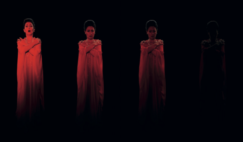


